
Write the Perfect Resume in 9 Simple Steps (With Examples)
Sometimes, a good resume isn’t enough. Find out how to make a perfect resume that proves you’re the best candidate for the job.

Olga Ber
Career Expert
First impressions are important. That's why you need to choose the best resume layout there is.
Truth be told, hiring managers don't read all resumes, they scan them. That's why if you want the job, your resume needs to help them to make the right choice.
In this guide we’ll show you:
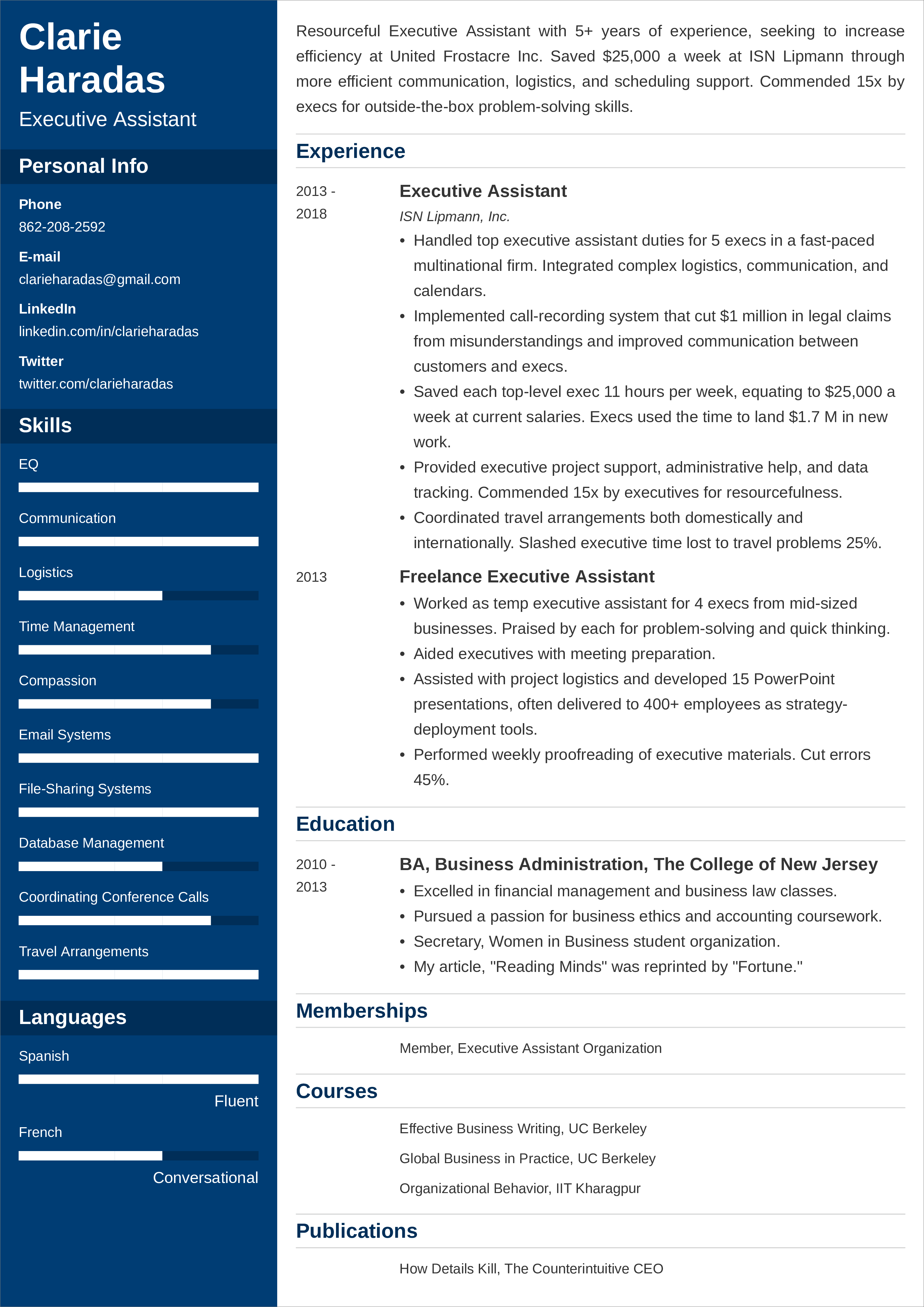
Save hours of work and get a job-winning resume like this. Try our resume builder with 20+ resume templates and create your resume now.
What users say about ResumeLab:
I had an interview yesterday and the first thing they said on the phone was: “Wow! I love your resume.”
Patrick
I love the variety of templates. Good job guys, keep up the good work!
Dylan
My previous resume was really weak and I used to spend hours adjusting it in Word. Now, I can introduce any changes within minutes. Absolutely wonderful!
George
Looking for more information on resume writing? See our other articles:
Looking for more resume examples? Check out these ones:
By studying over 500,000 resumes crafted with our builder, we found that*:
- Cascade, Primo, and Cubic are our most popular resume templates.
- Median creation time for a resume on ResumeLab is just 21.3 minutes.
- 39.68% of our users have over 10 years of work experience.
* The data comes from the last 12 months (August 2023-August 2024).
There are certain basic formatting rules that can help you create a good resume layout in no time.
If the resume is a picture of your professional life then the margins are the frame—you need to make sure they don’t dominate the whole. The best size for resume margins is 1 inch all around. If you need more space, don’t make the margins smaller than 0.5 inch.
The resume header is the topmost section of a resume that includes your contact details. See to it that it has all the relevant (and up-to-date) info. Make it pop out so that the recruiter won’t have to fumble for your phone number if they want to give you a call.
Comic Sans, Papyrus, Neuland Inline. None of those should end up on your resume. Not even if you go for the most creative resume layout. So what resume fonts to use? Simple and legible. Your resume is a professional document, so don’t spoil it with a theme park font that’s difficult to read.
Also, you need to strike the right balance between the font size and document length. Don’t make the font look minuscule to be able to fit in as much as you can on a single page (if you have too much information, write a two-page resume). For body text use the font size of 11–12pts. For section headings, use 2–4pts larger fonts.
Expert Hint: Studies reveal that it’s recommended to avoid extremes when it comes to line spacing. So stick to single-line and if your text looks too dense increase the spacing to 1.15. But avoid double-spaced lines.
The most important thing about your resume layout? It has to be scannable. One way of making it easy for the recruiter to scan is to use appropriate resume section titles. So, put the word Experience above the experience section, don’t call this section My Life in Numbers, for example. With simple headings, you can rest assured that both the ATS and recruiter will know exactly where to look for the information they’re after.
Pick a free MS word resume template or a Google Docs resume template if you want to speed up the process.
Typically, resume layouts consist of several separate but interrelated sections. Here’s a list of most commonly used ones:
Depending on the section, you will want to use different formatting to make the most of the space you have. For example, the career summary works best as a short paragraph, whereas a list of bullet points is perfect for presenting your experience and key achievements.
Einstein famously said everything should be made as simple as possible, but not simpler. As to the length of a resume, it should be as long as necessary, but not longer. Don’t try to squeeze everything into a single page and don’t write a novel. Two pages should be more than enough to present your expertise.
Now that you know how to format your resume layout properly, let’s have a closer look at how to make the most of your document.
There are three common resume layouts: chronological resume, functional resume, and combination resume. Each of them has certain strengths and weaknesses, and you should be aware of them before you start making your resume.
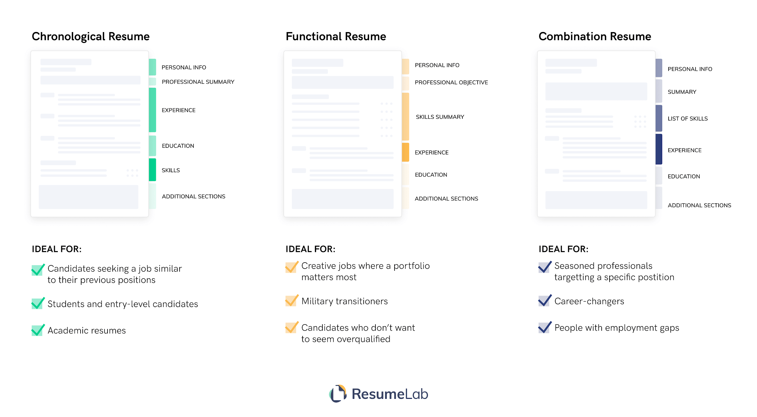
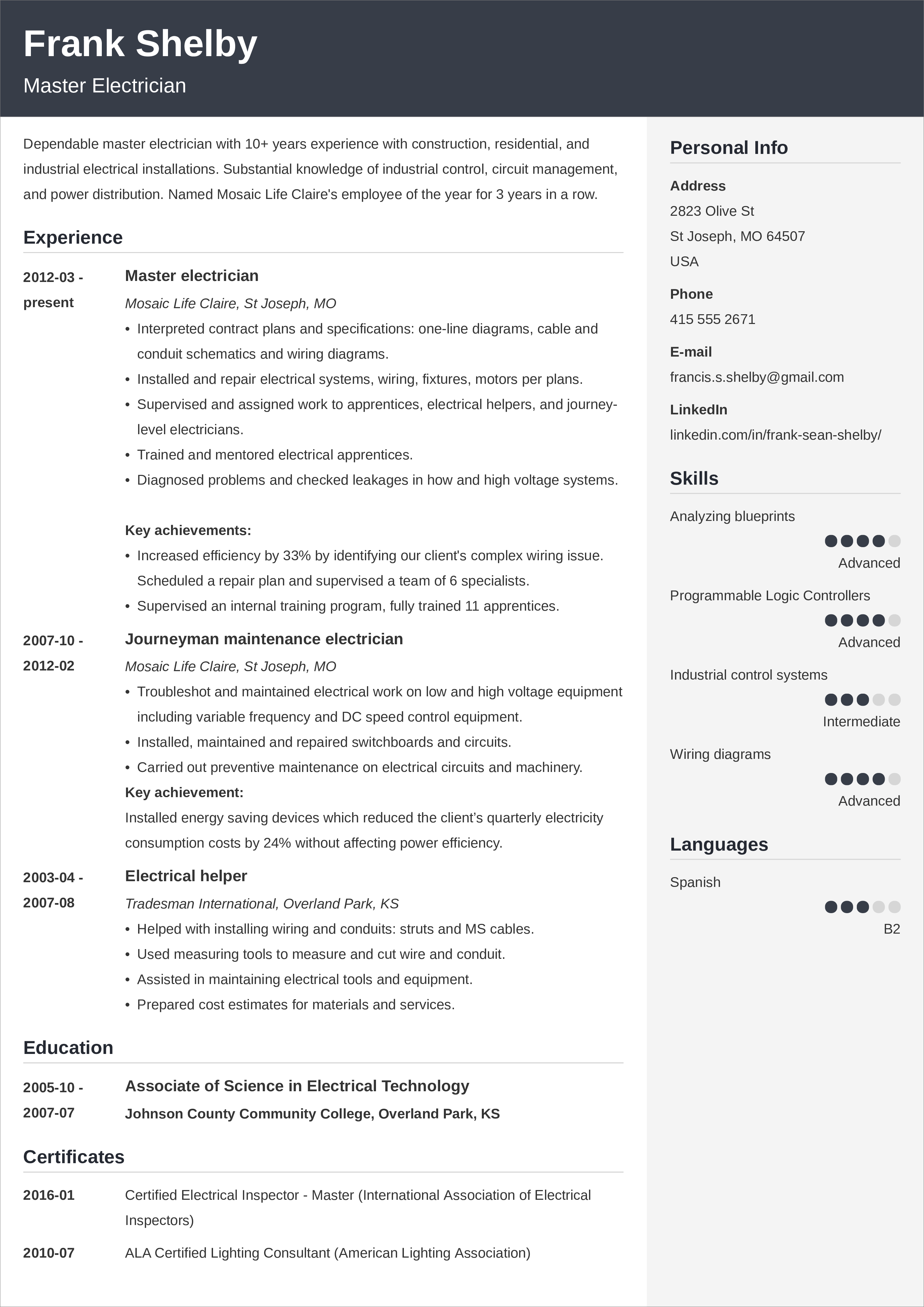
The chronological resume is the most universal type of resume layout. It’s suitable for job seekers at all stages of their careers: from students to entry-level applicants to seasoned pros. This kind of layout recounts your professional life in a reverse-chronological manner. However, since it’s based on a timeline of your employment history, it may not be the number one choice for those with employment gaps.
Here’s a chronological resume layout example:
The functional resume brings your skills to the fore. In contrast to the previous resume layout type, this one isn’t preoccupied with chronology or dates. In fact, you can skip dates entirely if you’re not comfortable using them. Functional resumes are a good choice for creatives who treat a resume as an addition to their portfolio, or those who want to mask gaps in employment.
Here’s a functional resume layout example:

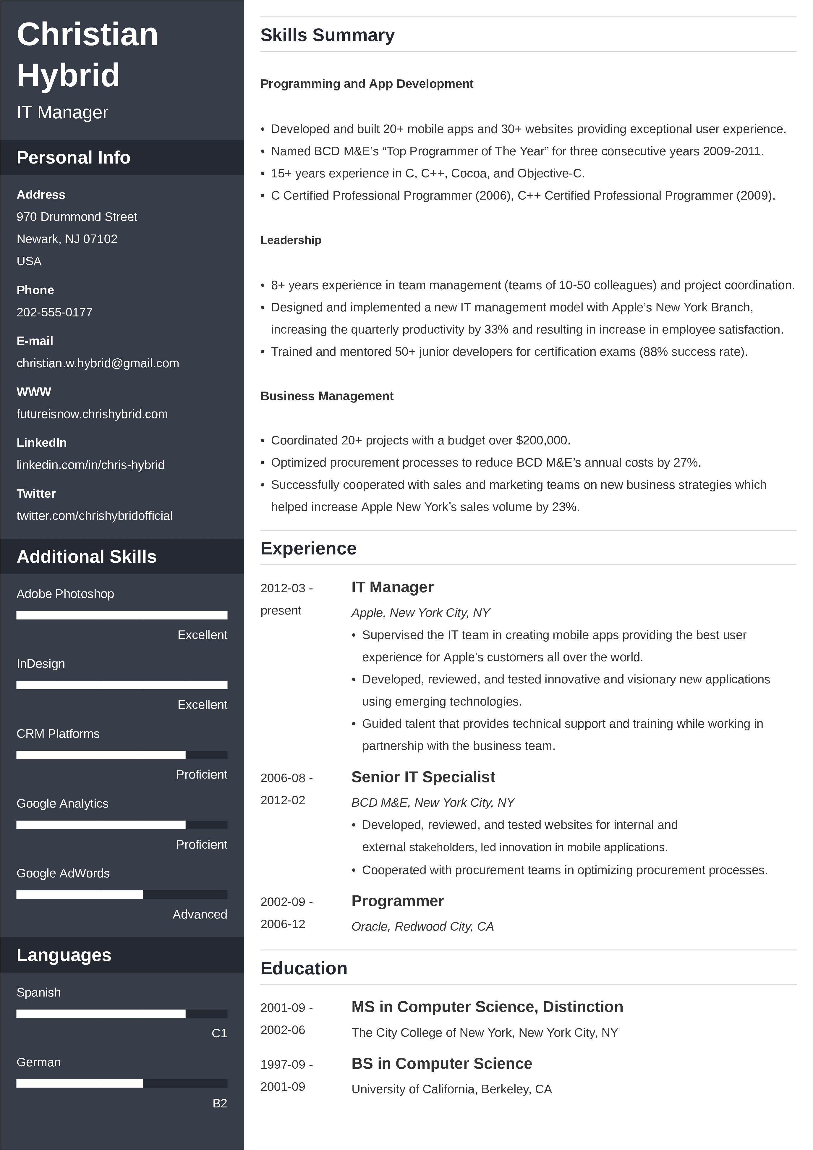
The combination resume, as the name suggests, brings together the best elements of each of the other resume layouts. It usually consists of a large section that summarizes your skills and smaller experience and education sections.
Here’s a combination resume layout example:
Now you know the three most popular resume layouts.
However, if you're still struggling with resume writing, read our comprehensive guide on how to write a resume.
You may also want to check our resume examples for different types of jobs and industries. It'll definitely help you get started.
Let's now move to the gallery of resume layout examples
Expert Hint: When should you use a resume, and when is it better to use a curriculum vitae? It depends. CV and resume actually have a different meaning across languages. Read about the difference between a resume and a CV.
The ResumeLab builder is more than looks. Get specific content to boost your chances of getting the job. Add job descriptions, bullet points, and skills. Easy. Improve your resume in our resume builder now.
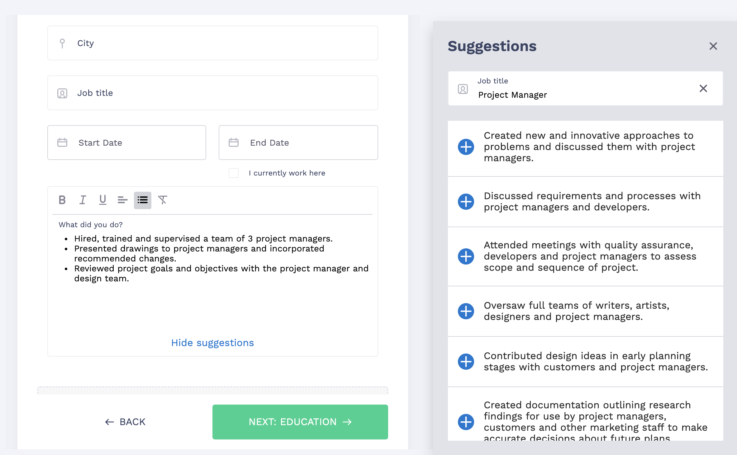
Nail it all with a splash of color, choose a clean font, and highlight your skills in just a few clicks. You're the perfect candidate, and we'll prove it. Use our resume builder now.
Have a look at these resume layout ideas:
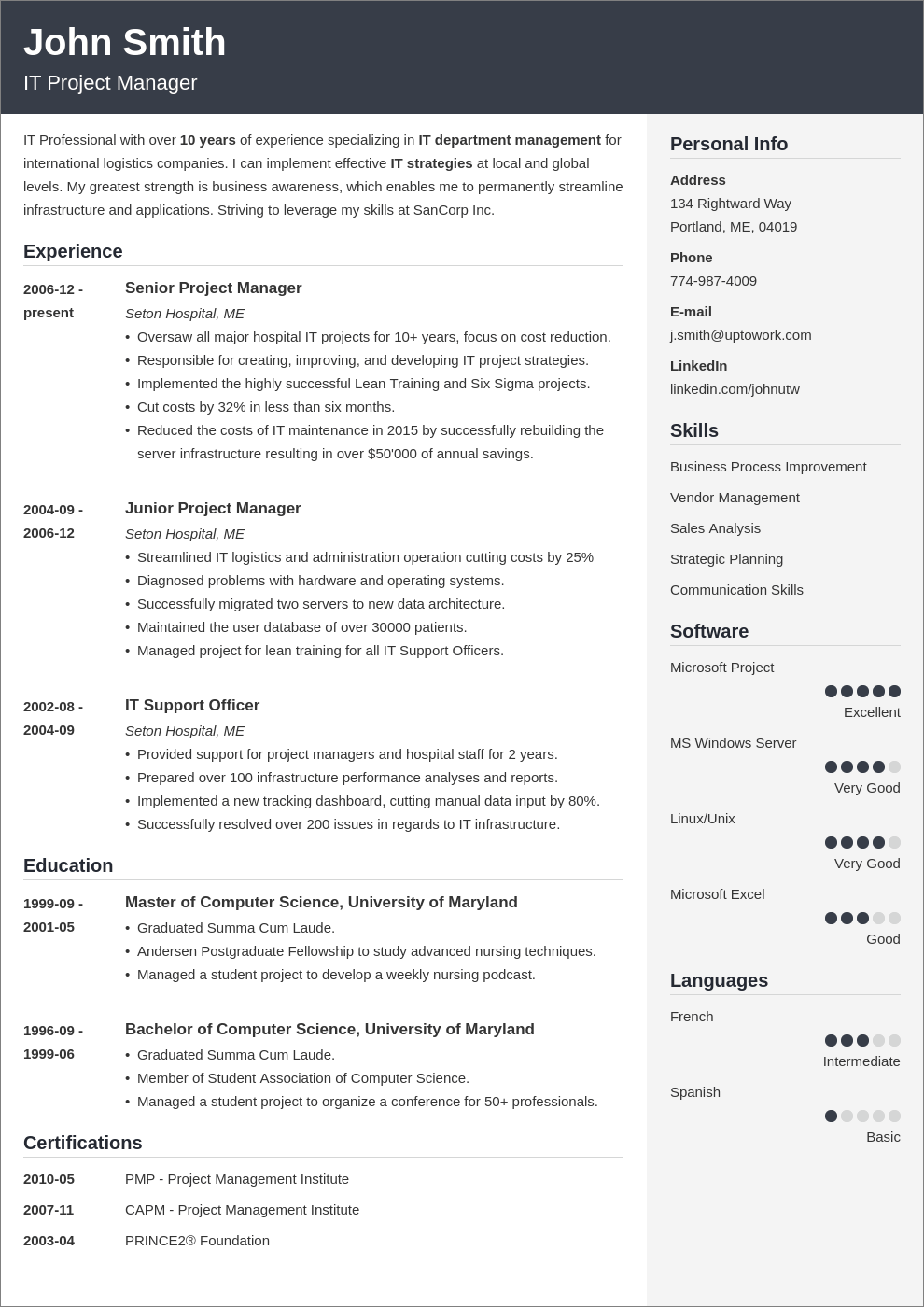
This resume layout consists of three distinctive sections—each of a different color. The main part of the resume is where the resume profile, experience, education, and certification sections are. The gray sidebar on the right gives you extra space for presenting your contact details and extra skills.
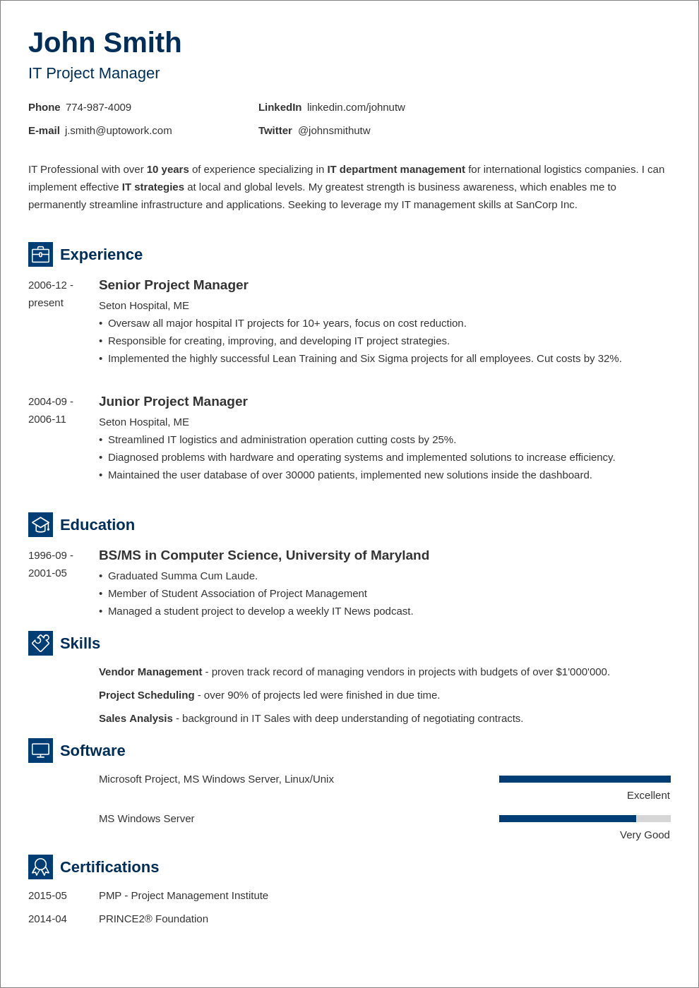
This single-column resume layout is versatile enough to appeal to both experienced and inexperienced candidates writing an entry-level resume. Simple resume icons next to each section’s heading make it easy to navigate. The bars representing your level of proficiency make the resume skills section pop out.
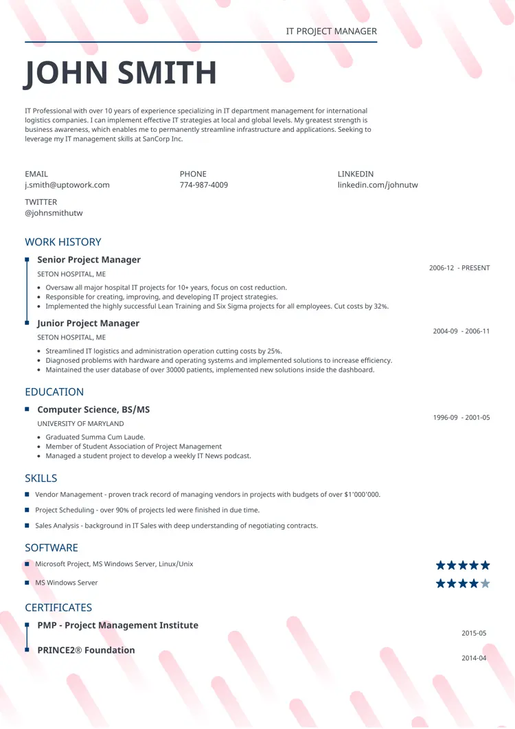
Want to ensure your resume gets noticed? Break away from the pack with the Dynamic resume layout. Its effective background usage highlights the middle section of your resume, drawing the reader’s eye to your most pivotal experiences and skills on a creative one-page template.
Expert Hint: Not all Free Resume Builders are ATS friendly. To make sure your creative resume reaches a human reader, send it directly to the recruiter's inbox.
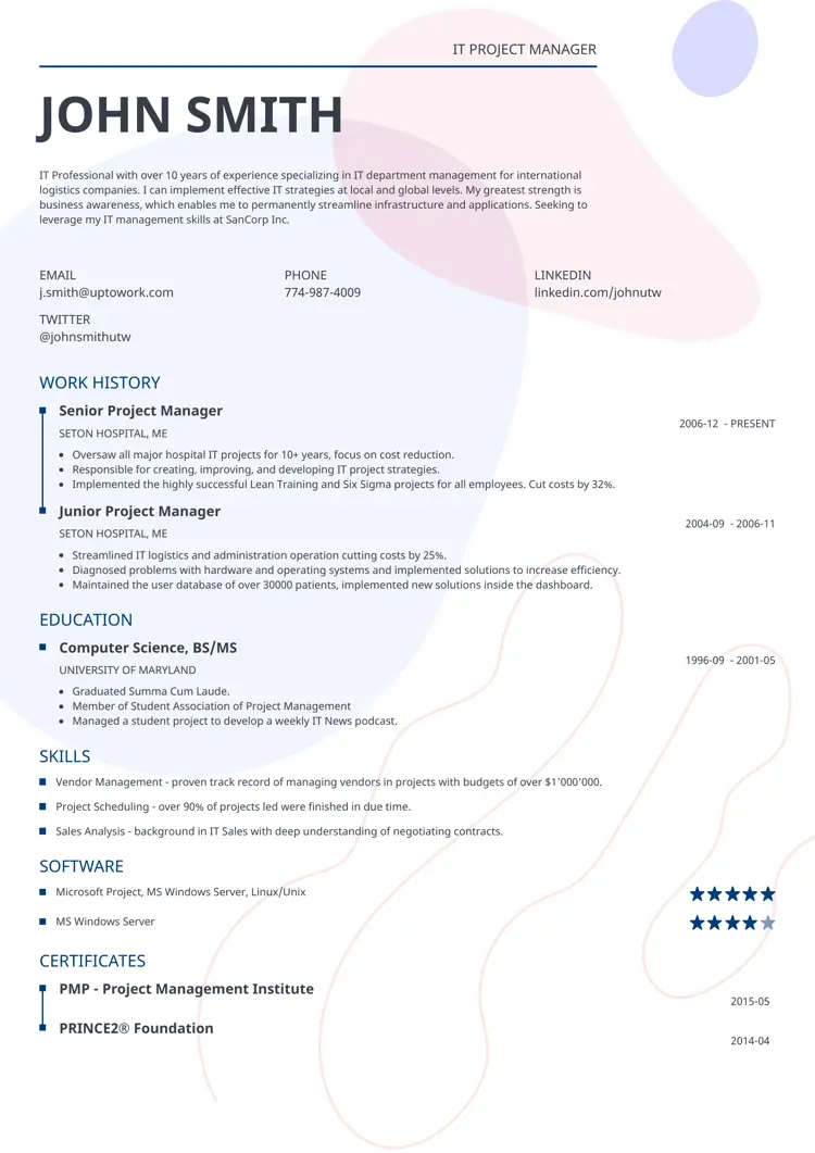
Impetus is the next generation of our premier resume template, now with a colorful and artistic background. The modern resume layout style ensures it's instantly memorable, perfect for those looking to make an impactful first impression.
Expert Hint: Studies show that recruiters only spend about 7 seconds scanning a resume. In this time they look at specific areas and search for particular information. Use bold and italics to direct their attention to the most important bits.
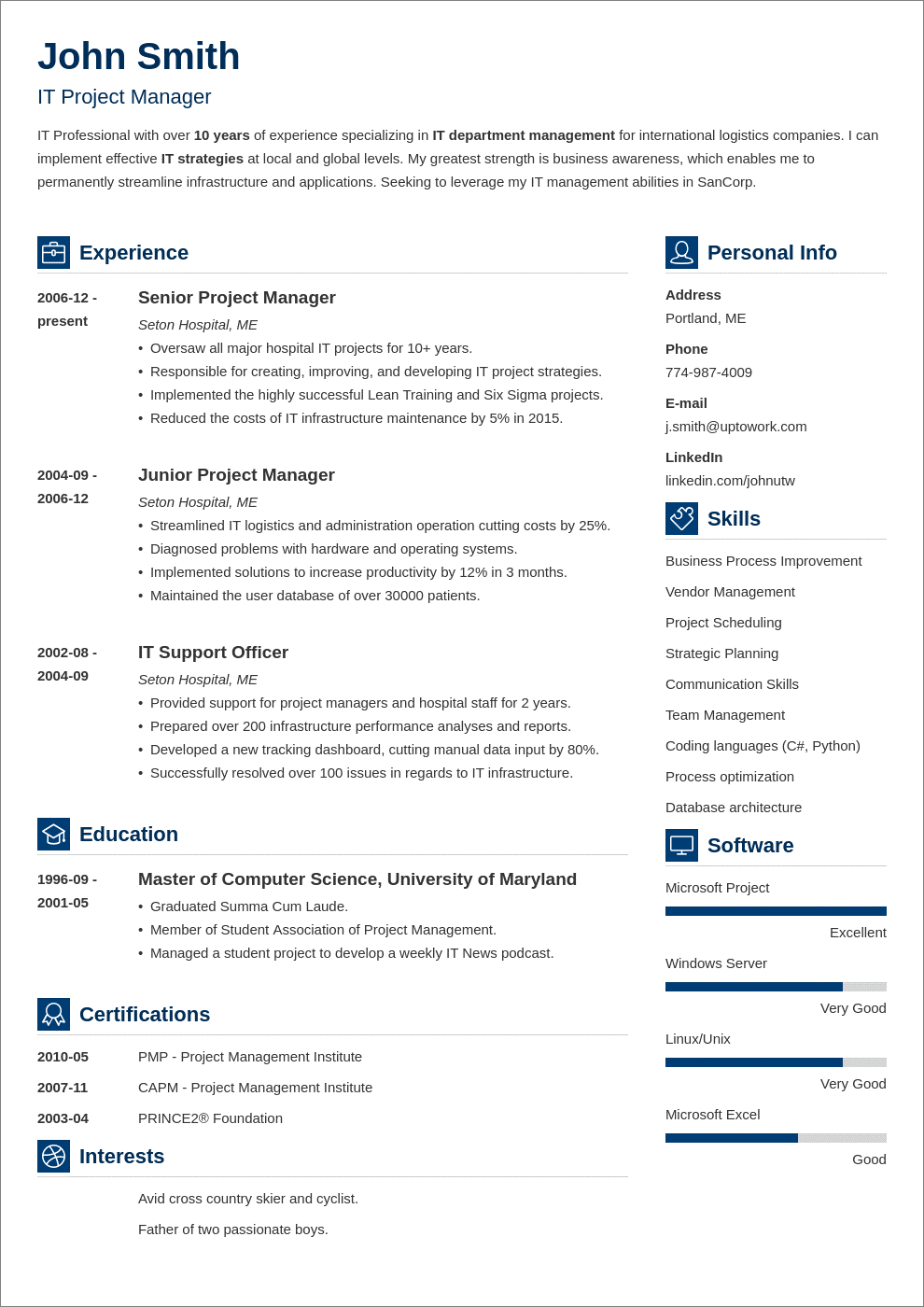
This layout is minimal in form but utilizes the space on a single page to the maximum. Also, the qualifications summary section stretches from margin to margin giving you plenty of room to highlight your top achievements.
Double your impact with a matching resume and cover letter combo. Use our cover letter generator and make your application documents pop out.
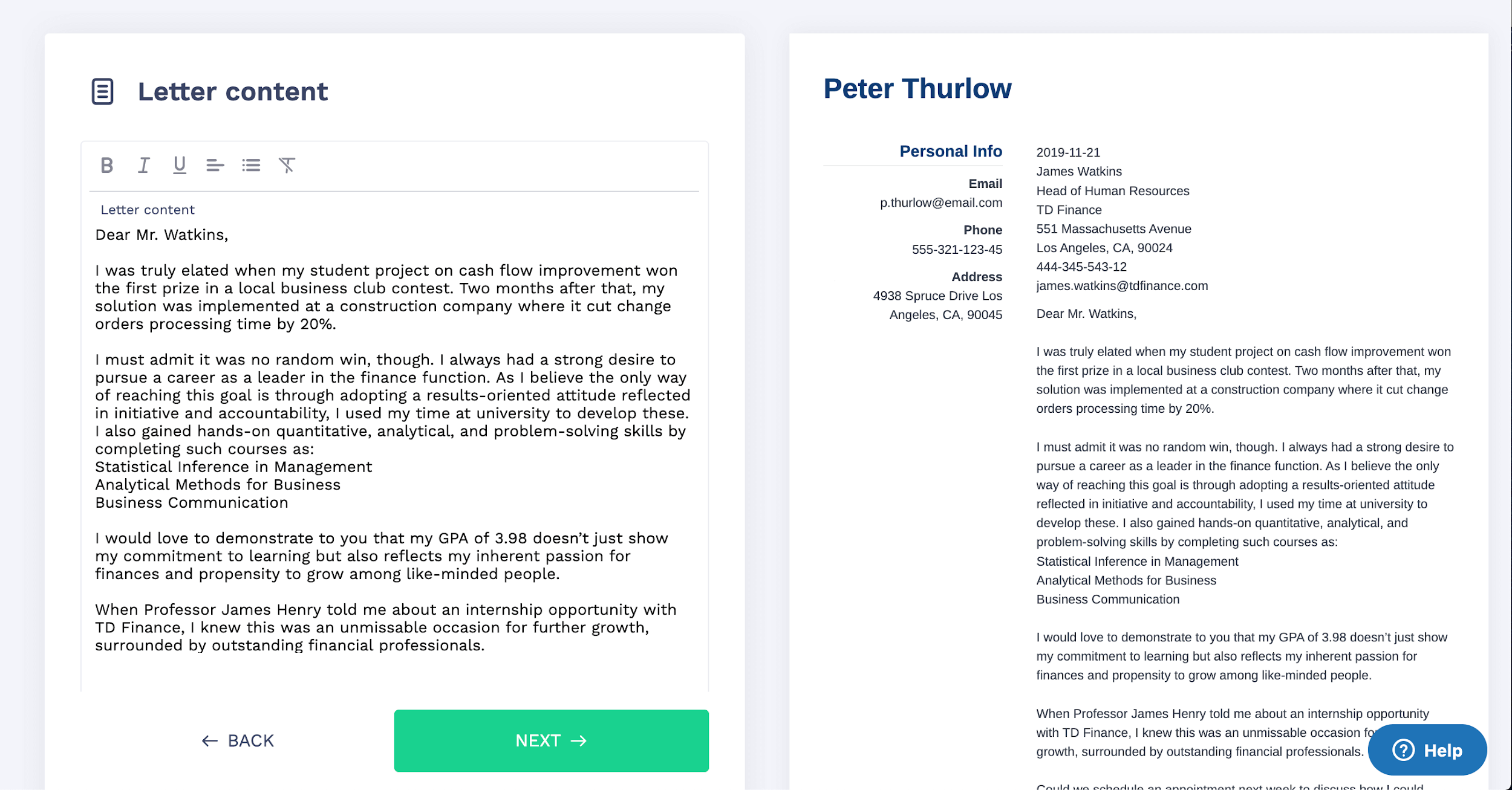
Want to try a different look? There's 21 more. A single click will give your document a total makeover. Pick a cover letter template here.
The best resume layouts highlight just the information recruiters look for as they’re scanning the resume for the first time.
Do you have any questions? Would you like to share your observations on the best resume layouts? We’d love to hear from you! Give us a shout out in the comments below.
*Data was collected from July 2023 to June 2024.
At ResumeLab, quality is at the crux of our values, supporting our commitment to delivering top-notch career resources. The editorial team of career experts carefully reviews every article in accordance with editorial guidelines, ensuring the high quality and reliability of our content. We actively conduct original research, shedding light on the job market's intricacies and earning recognition from numerous influential news outlets. Our dedication to delivering expert career advice attracts millions of readers to our blog each year.
You need to choose one of the three main resume layouts, depending on several factors:
As a rule of thumb, the best resume layout is the reverse-chronological resume. This layout is the most ATS-friendly. It emphasizes your work experience, clearly showing the recruiter your strengths and the benefits you would bring to the company.
Apart from choosing a fitting resume template, there are a few things you must do to create an appealing resume layout:
To improve your resume layout, apply the following tips:
Remember to format your resume properly: Use a readable font, set 1-inch margins to create white space, use clear and bold section headings and utilize bullet points to present information in a scannable format.
Most employers prefer the reverse-chronological resume layout. It’s the most common resume style and works well with ATS software. It’s also the most familiar style to recruiters, making it the easiest one for them to read.
Your resume, cover letter (and, in some cases, your portfolio) are all parts of your job application. And all of them should maintain visual cohesion. It's recommended to maintain a consistent visual style and formatting between them. This primarily applies to the chosen visual template, fonts, and their sizes, resume header & contact information, and the overall structure.
Including references directly on a resume is not a common practice. Instead, creating a separate document, known as a "References Page," is more typical, which you can provide to employers upon request.
Remember to always ask for permission from your references before including their information on your resume or sharing it with potential employers. Also, don't include the phrase "References available upon request" on your resume. It's generally understood that you will provide references if requested.
A portrait layout resume refers to a resume format that is designed and formatted vertically, with the longer side being the height of the page. In contrast, a landscape layout resume is formatted horizontally, with the longer side being the width of the page.
In such a resume layout, the various sections, such as contact information, summary, work experience, education, and skills, are arranged in a top-to-bottom sequence.

Sometimes, a good resume isn’t enough. Find out how to make a perfect resume that proves you’re the best candidate for the job.

Olga Ber
Career Expert

A professional resume outline can help you structure your resume and make the writing process as easy as 1-2-3. Let our resume outline examples and expert tips guide you through.

Roma Konczak, CPRW
Certified Professional Resume Writer, Career Expert

Job hunting can be confusing. You know you need a resume, but what is it exactly, and how to even write one? Deep breaths. Read on to learn everything you need to know.

Michael Tomaszewski, CPRW
Certified Professional Resume Writer, Career Expert