How Long Should a Resume Be: The Best Resume Length
How long should a resume be? One page? Two pages? Does it even matter? We’re here to answer all your questions about resume length!

Olga Ber
Career Expert
A nightmare scenario. You’ve prepared a perfect resume. You’ve got the right skills and top-class experience for the job. You even included a cover letter. Yet, nobody called back.
Why? Because your resume is as illegible as a doctor’s prescription. Good resume layout is key. And to have a good layout, you need to use the best font for a resume. Otherwise, nobody will care to lay their eyes upon it.
This guide will show you:
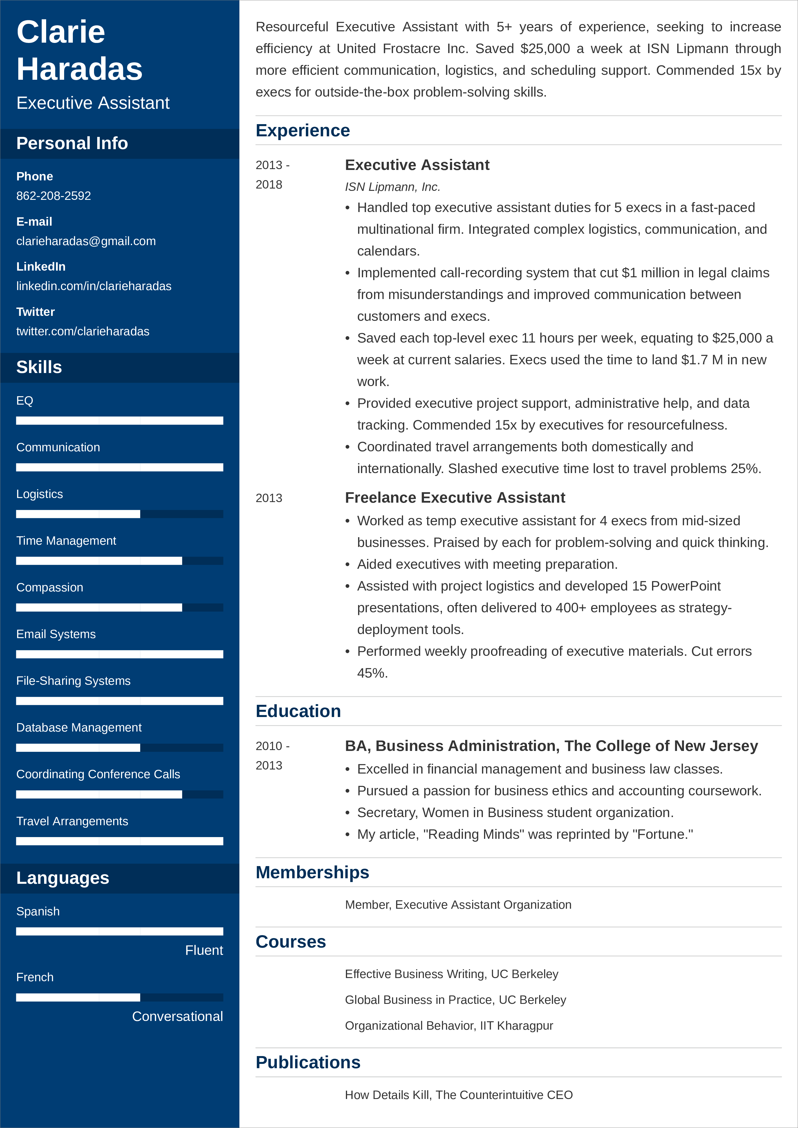
Save hours of work and get a job-winning resume like this. Try our resume builder for free. Start by choosing a resume template.
What users say about ResumeLab:
I had an interview yesterday and the first thing they said on the phone was: “Wow! I love your resume.”
Patrick
I love the variety of templates. Good job guys, keep up the good work!
Dylan
My previous resume was really weak and I used to spend hours adjusting it in Word. Now, I can introduce any changes within minutes. Absolutely wonderful!
George
With so many creative resume designs and fonts available, one can be tempted to use them to reflect their personality and style. However, with unusual resume characteristics like non-standard fonts, a resume can become hard to read. Here’s how to find the best font for a resume to make it both appealing and legible.
The best font size for resume text is between 11–12pts. If you can’t fit in all crucial information on one page, then 10pts is the way to go. Smaller fonts can also be useful for less consequential text, such as dates worked at a past job.
For resume subsections and their headings, you can increase that size 2–4pts (13–16pts) to help them stand out and help scannability. Finally, your name at the top can be another 2–4pts larger than that (15–20pts) to help it stand out well and act as a sort of resume page title.
Common resume fonts include both serif and sans serif fonts that we will describe further in the article:
The Calibri font is one of the sans serif, modern fonts. It is the default font in Microsoft Office, and it has recently been added to Google Docs.
Its widespread usage means that HR managers and ATS software will be able to open your documents and render them correctly (that does not mean you shouldn't use an ATS-friendly resume template).
Calibri is often considered the best font for a resume. Many resume experts agree that it is among the best sans serif fonts—it constantly makes all the top-10 lists.
Great Calibri alternatives include Raleway, Helvetica Neue, and Open Sans.
Expert Hint: Serif vs sans serif, what do they mean? Serifs are those tiny brushstrokes at the ends of letters’ lines (such as the three points of a letter y). Sans-serif fonts are more modern typefaces which don’t include those brushstrokes.
The Cambria font is like Calibri’s serif counterpart, and it is also one of the most popular and best resume fonts in use.
Likewise, Cambria is available for both Google Docs and Microsoft Office products, so hiring managers will be able to view your resume as you intended. It is our choice among the best serif fonts on our list.
Excellent alternatives for Cambria include the Source Serif 4 and ITC Charter font types.
Noto fonts is Google’s largest typeface project in which they aim to have one font family that can cover every available language and glyph out there.
Also, Noto fonts is open source and freely available, making it a great choice for resume writers, especially if needing to use a non-Latin alphabet.
Noto is available in both serif and sans serif variants. Looking for the best resume Google fonts? This is it.
Expert Hint: Serif or sans serif for resumes? An old study used to say serif fonts help legibility. However, newer studies say that sans serif fonts are easier to read on older screens, but serif fonts are okay for headings and section titles.
The Georgia font is considered one of the best resume fonts, too.
Georgia is our second serif font on the list, and many large names use it today; it is the New York Times font as well as Amazon’s.
Best resume font alternatives for Georgia include Droid Serif and PT Serif.
The Helvetica font has been a popular choice of designers and advertisers for decades. Helvetica is used by the NYC subway system and the UK’s National Health Service.
Though this sans serif font has been around for over a half century, it still remains one of the foremost modern fonts.
Neue Haas Grotesk and Proxima Nova are some great substitutes for Helvetica, as well as the similarly-popular Arial font.
Expert Hint: Never use a script font or cursive font on a resume or a cover letter. It’s hard to read, and THAT makes you hard to hire.
The Garamond font is a blend of traditional serifs mixing with a more modern design. Though the Garamond typeface family is centuries old, designers continue to praise it as one of the most elegant fonts.
The Cormorant font is a popular, freely-available replacement for Garamond.
The Verdana font is a sexy, full-figured typeface which was created for Microsoft to be a sans serif counterpart to the Georgia font we mentioned earlier.
Verdana is a top resume font, due to its excellent readability even at very small font sizes—perfect for employers!
A popular Verdana alternative is Microsoft’s Tahoma font.
The Lato font was created for Poland’s first independent daily newspaper just two decades ago, but since has grown into a worldwide phenomenon.
Lato is an open source font, and it covers Latin, Cyrillic, Greek, and IPA alphabets and scripts, making it perfect for many international CVs.
Expert Hint: Typeface vs font? When you think of a font such as the Century Gothic font, Times New Roman font, or Didot font, you are technically referring to a specific typeface (a font family). Calibri (as a whole) is a typeface, while Calibri italicized, 12pt is a font. You better know the difference if getting a job in design!
The Trebuchet font (or Trebuchet MS) is a sans serif font created for Microsoft by Vincent Connare, who also created the notorious Comic Sans font which renders all resumes unreadable.
(Avoid Comic Sans at all costs!)
As Microsoft puts it, he “created a font that works at heading and display sizes as well as small sizes and low resolutions.” That makes Trebuchet perfect for the large text of modern resume headers.
Fira Sans and Allerta are two awesome substitutes for Trebuchet MS.
Finally, a wildcard: the Book Antiqua font. This font may seem dated, but it’s held on for years and years. Today, it is still popular on more traditional resume formats.
Book Antiqua is a “a roman typeface based on pen-drawn letters of the Italian Renaissance.” Definitely one of the most classy fonts out there.
Expert Hint: Ever saw a font you like online and couldn’t figure out its fonts style? There are tools that can help you identify the fonts that you spotted.
The ResumeLab builder is more than looks. Get specific content to boost your chances of getting the job. Add job descriptions, bullet points, and skills. Easy. Improve your resume in our resume builder now.
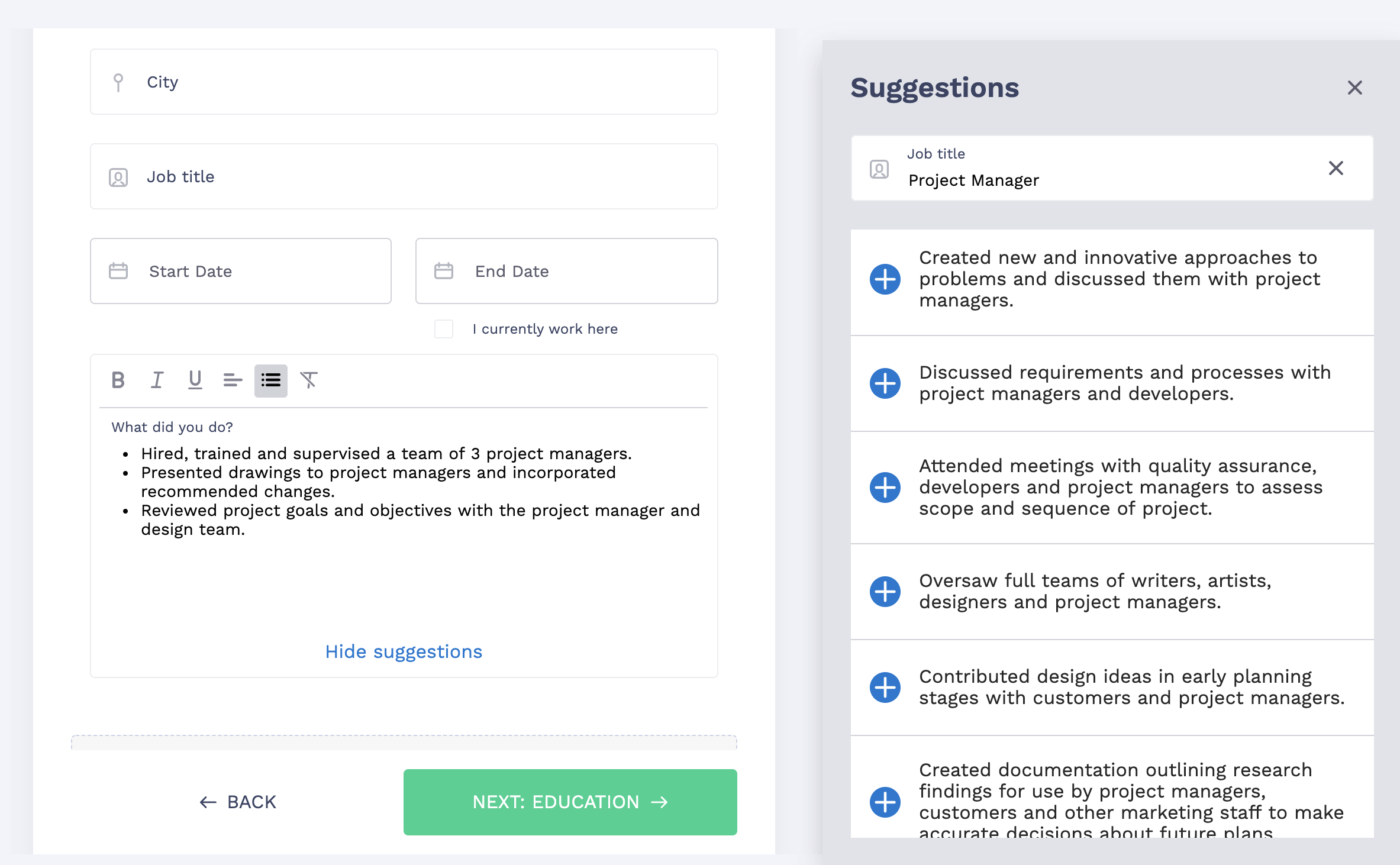
Nail it all with a splash of color, choose a clean font, and highlight your skills in just a few clicks. You're the perfect candidate, and we'll prove it. Use our resume builder now.
To accentuate important information such as your name or section headings, you can use additional text styling. Bolding and italicising work best in this case as long as they're applied in a consistent manner.
Bold font—Bold text is particularly useful for drawing the reader’s attention to specific words or phrases. In the case of resume writing, you can guide their gaze over to resume keywords.
In the resume work experience section, bolding is great to start off each entry, specifically to highlight the position you have/had. Check the example:
Relevant coursework:
Italic font—Italics are great for supporting text, such as dates and explanatory statements.
In the resume work history area, italics comes in handy for the second line, where you give the company name you worked for, along with the city and state. See the example:
Junior Flight Attendant
jetBlue Airways, New York, NY
January 2016–Present
And what about other text adjustments?
Underline—Don’t underline text on your resume. Underlining will already be used on digital resumes to identify and email addresses and URLs, such as your LinkedIn profile. Any more underlined text and the resume starts feeling messy.
Font Color—For most resume designs, you’re best sticking with a black color font. Black stands out best against light (hopefully white) backgrounds, making it clear and legible. It's all about balancing resume style and readability.
However, if you have a dual-tone resume, with say a heading area in dark blue, white text goes well here.
Kerning—In typography, kerning is the adjustment between letters. In some more advanced word processing programs, you may be able to adjust this font spacing. Letters too close together have been proven to be hard to read.
Line spacing—When writing, line spacing is the space that separates one row (line) of text with the row above or below it. For resumes, keep it single-spaced. In terms of line space size, that should equate to 1.0–1.15.
Expert Hint: Use resume font styling such as italics and bold sparingly. Too much will be counterproductive to the points you were trying to highlight. Also, don’t use too many colors on your resume, whether in text or otherwise.
Graphic designers and other artistic people often pair fonts together. Why pair resume fonts? If you find two fonts that complement each other well, it can really make your resume stand out and pop. As a job seeker, you want that!
On resumes, the most common font pairings come where body text is either serif or sans serif, with headings and subsection titles being the opposite.
Here’s what that may look like:

Together, the sans serif title with the serif body text (or vice versa) provide a stark contrast that make it a more pleasurable (which could translate to longer!) reading experience. Try using a font generator to preview how your resume text would look using different fonts.
Expert Hint: “Should I include a cover letter in my application documents?” Our recent survey revealed that 4 out of 5 recruiters will consider a cover letter from you an important part of your job application. Learn how to write a cover letter asap!
Double your impact with a matching resume and cover letter combo. Use our cover letter generator and make your application documents pop out.
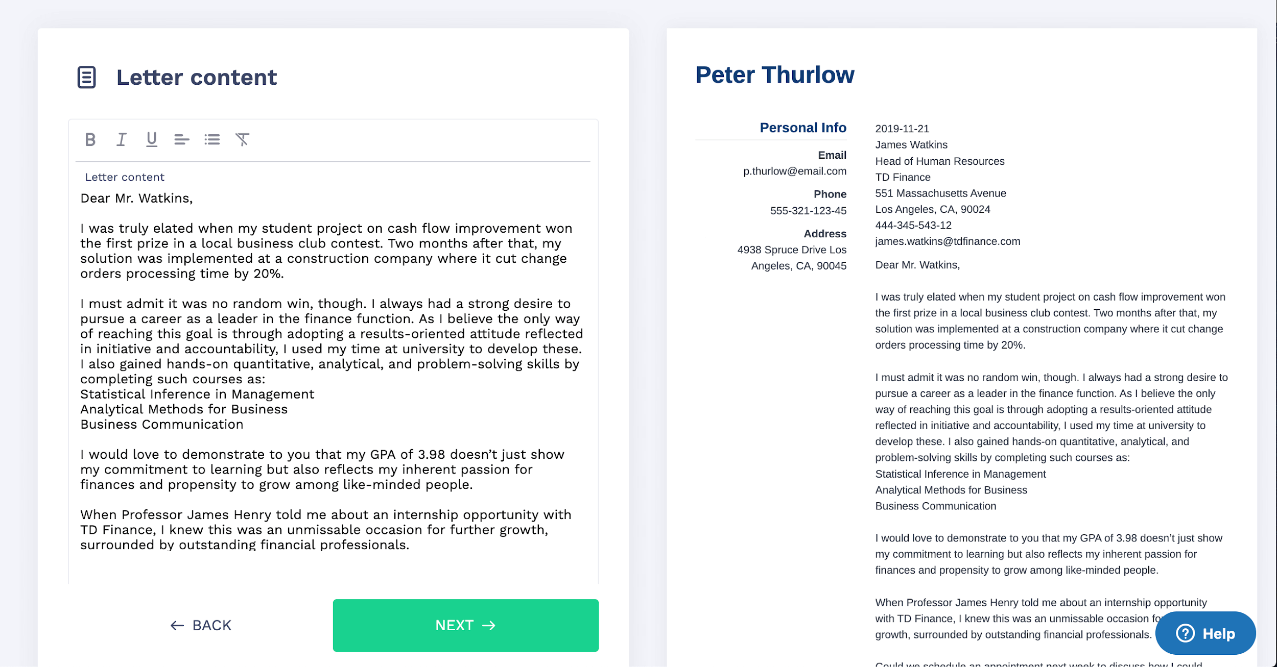
Want to try a different look? There's 21 more. A single click will give your document a total makeover. Pick a cover letter template here.
Got any questions on what font to use for a resume? Any helpful tips for font pairing? Let’s talk about it in the comments below, and, as always, thanks for reading!
At ResumeLab, quality is at the crux of our values, supporting our commitment to delivering top-notch career resources. The editorial team of career experts carefully reviews every article in accordance with editorial guidelines, ensuring the high quality and reliability of our content. We actively conduct original research, shedding light on the job market's intricacies and earning recognition from numerous influential news outlets. Our dedication to delivering expert career advice attracts millions of readers to our blog each year.

How long should a resume be? One page? Two pages? Does it even matter? We’re here to answer all your questions about resume length!

Olga Ber
Career Expert
How do you write a resume? With so many conflicting opinions out there, we’ve set out to find the ultimate answer to this question.

Michael Tomaszewski, CPRW
Certified Professional Resume Writer, Career Expert
You can stop searching—this is the ultimate collection of best resume tips that can help you succeed in 2026. These resume writing tips will help to impress hiring managers.

Roma Konczak, CPRW
Certified Professional Resume Writer, Career Expert